12. Adaptation of Univariate Plots
L4 121 Adaptations Of Univariate Plots V3
Data Vis L4 C12 V2
Adapted Bar Charts
Histograms and bar charts were introduced in the previous lesson as depicting the distribution of numeric and categorical variables, respectively, with the height (or length) of bars indicating the number of data points that fell within each bar's range of values. These plots can be adapted for use as bivariate plots by, instead of indicating count by height, indicating a mean or other statistic on a second variable.
For example, we could plot a numeric variable against a categorical variable by adapting a bar chart so that its bar heights indicate the mean of the numeric variable. This is the purpose of seaborn's barplot function:
Example 1.
base_color = sb.color_palette()[0]
sb.barplot(data=fuel_econ, x='VClass', y='comb', color=base_color)
plt.xticks(rotation=15);
plt.ylabel('Avg. Combined Fuel Efficiency (mpg)')
Different hues are automatically assigned to each category level unless a fixed color is set in the "color" parameter, like in countplot and violinplot.
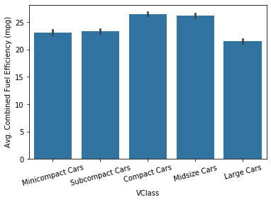
The bar heights indicate the mean value on the numeric variable, with error bars plotted to show the uncertainty in the mean based on variance and sample size.
# Try these additional arguments
sb.barplot(data=fuel_econ, x='VClass', y='comb', color=base_color, errwidth=0)
sb.barplot(data=fuel_econ, x='VClass', y='comb', color=base_color, ci='sd')
As an alternative, the pointplot() function can be used to plot the averages as points rather than bars. This can be useful if having bars in reference to a 0 baseline aren't important or would be confusing.
Example 2.
sb.pointplot(data=fuel_econ, x='VClass', y='comb', color=base_color, ci='sd', linestyles="")
plt.xticks(rotation=15);
plt.ylabel('Avg. Combined Fuel Efficiency (mpg)')
By default, pointplotwill connect values by a line. This is fine if the categorical variable is ordinal in nature, but it can be a good idea to remove the line via linestyles = "" for nominal data.
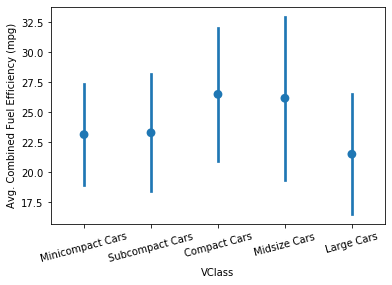
The above plots can be useful alternatives to the box plot and violin plot if the data is not conducive to either of those plot types. For example, if the numeric variable is binary in nature, taking values only of 0 or 1, then a box plot or violin plot will not be informative, leaving the adapted bar chart as the best choice for displaying the data.
Example 3. Bringing a few charts together
plt.figure(figsize = [20, 5])
base_color = sb.color_palette()[0]

# left plot: violin plot
plt.subplot(1, 3, 1)
sb.violinplot(data=fuel_econ, x='VClass', y='comb', inner = None,
              color = base_color)
plt.xticks(rotation = 45); # include label rotation due to small subplot size

# center plot: box plot
plt.subplot(1, 3, 2)
sb.boxplot(data=fuel_econ, x='VClass', y='comb', color = base_color)
plt.xticks(rotation = 45);

# right plot: adapted bar chart
plt.subplot(1, 3, 3)
sb.barplot(data=fuel_econ, x='VClass', y='comb', color = base_color)
plt.xticks(rotation = 45);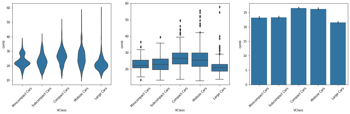
Do you know?
Matplotlib's hist() function can also be adapted so that bar heights indicate value other than a count of points through the use of the "weights" argument.